What is good design?
The approaches that define good design, and Rams's ten principles, through the words and work of Dieter Rams, Jony Ive, Josef Müller-Brockmann, Massimo Vignelli and Jan Tschichold.
There’s no single definition of good design. But look at the most influential designers of the 20th century, and you see the same ideas said again and again in different sentences. These ideas can be gathered into seven approaches, ten principles and four examples. There’s no ranking among them; they’re all equally important.
Seven approaches that define good design
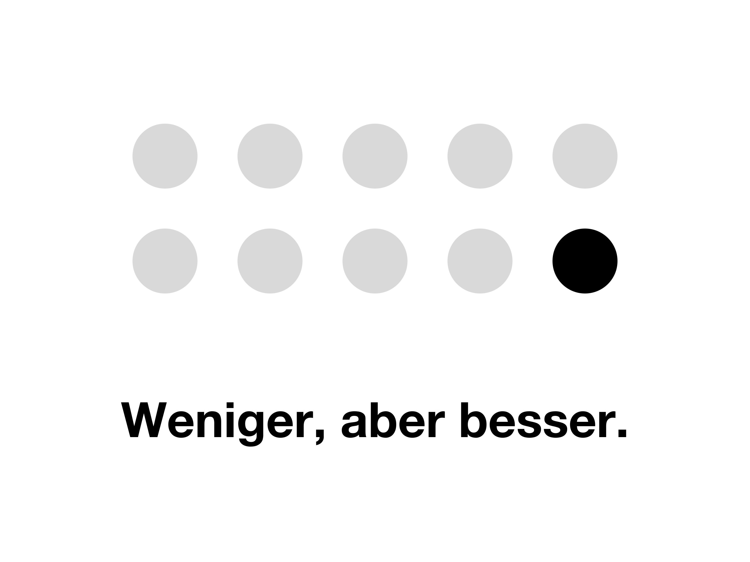
Less, but better
Dieter Rams’s design philosophy fits in three words: Weniger, aber besser (less, but better). It isn’t the absence of decoration; it’s removing the unnecessary, one thing at a time. What remains is only the object’s real job, and that job is done in the best possible way.
Function comes first
In good design, form grows out of what the object is for. The position of a button, the slope of a handle, the white space on a page; each has a reason. An element without a reason, however beautiful, gets in the way of the job.
Invisibility
Good design puts the job forward, not itself. While using an object, the user doesn’t notice the design; they only notice that the job gets done easily. Jony Ive describes this as a paradox: The goal is to leave the user with the sense that it wasn’t designed at all.
“Our goal is that you would have a sense that it wasn’t design.” (Jony Ive)
Care
Even the detail nobody will see should be thought through. According to Ive, people can sense whether an object was made with care, even if they can’t quite say why; and they sense carelessness the same way. How a product is finished on the inside matters as much as the outside.
Objectivity and order
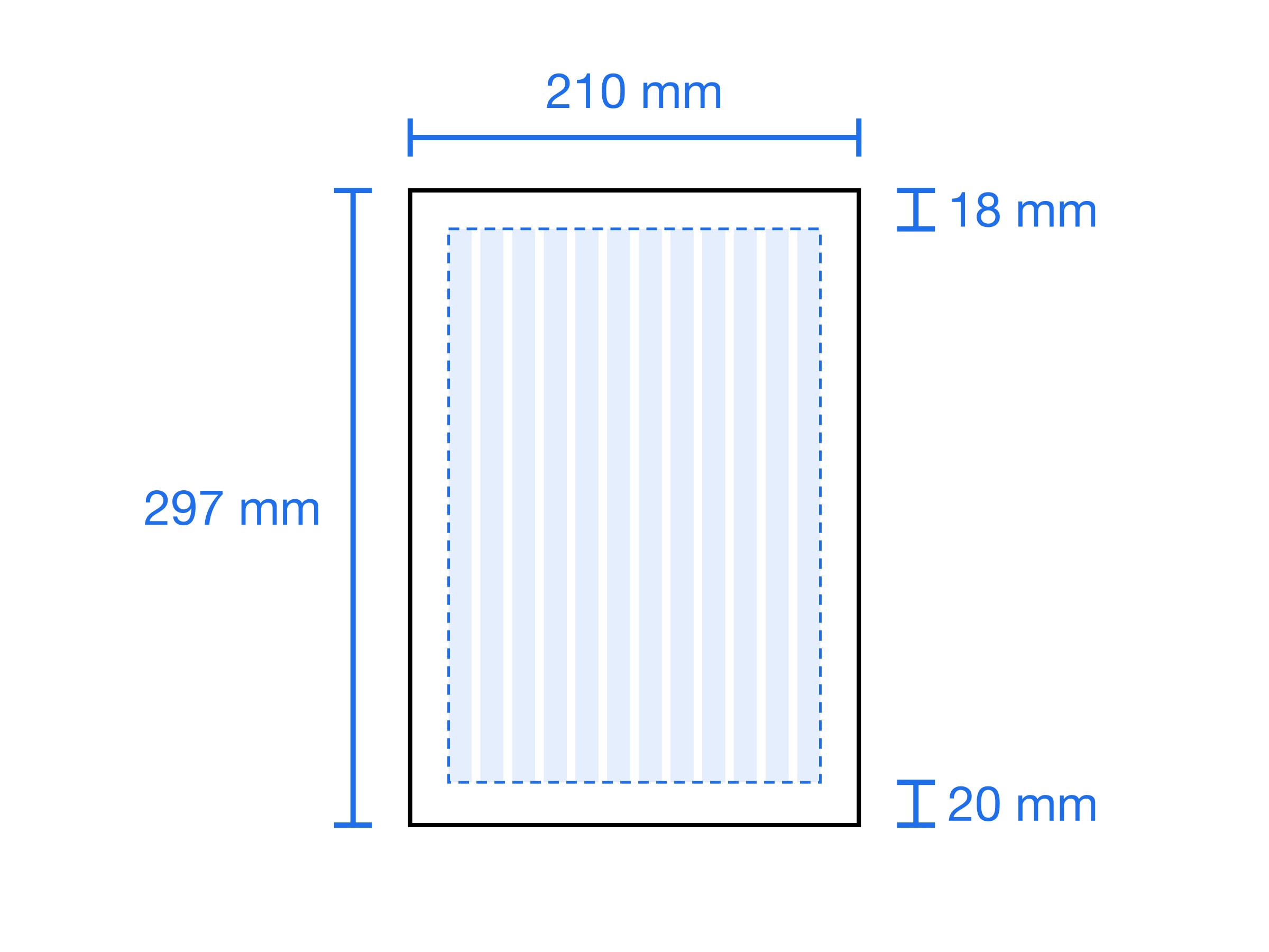
Josef Müller-Brockmann, one of the pioneers of the Swiss Style, sees the grid as the way to take design beyond personal taste. The grid gives every element a place and brings order to the page. But on its own it doesn’t guarantee good design; you have to learn to use it.
“The grid system is an aid, not a guarantee.” (Josef Müller-Brockmann, Grid Systems in Graphic Design)
Timelessness
What’s fashionable ages quickly. For Massimo Vignelli, good design isn’t a style but a language with rules; that’s why it stays valid years later.
“Styles come and go. Good design is a language, not a style.” (Massimo Vignelli)
Clarity
The job of design is to communicate. In Die neue Typographie, published in 1928, Jan Tschichold writes that the aim of the old typography was “beauty”, while the aim of the new is clarity. A design that can’t be read or understood hasn’t done its job, however beautiful it is.
“The essence of the New Typography is clarity.” (Jan Tschichold, Die neue Typographie)
Dieter Rams’s ten principles
In the 1970s, Rams asked himself a question: Is my design good design? He answered with ten principles. Today they’re used as a yardstick in almost every field, from industrial design to software interfaces. Good design:
- Is innovative. As technology develops, new possibilities open up for design; good design uses them but doesn’t make novelty a goal in itself.
- Makes a product useful. A product is bought to be used. Design removes everything that makes that use harder.
- Is aesthetic. The objects we use every day affect our lives. Beauty is part of usefulness.
- Makes a product understandable. Good design explains how the object is used on its own; at its best, it makes a manual unnecessary.
- Is unobtrusive. Products are tools, not works of art. Design stays in the background and leaves room for the user.
- Is honest. It doesn’t try to make a product look more innovative, powerful or valuable than it is; it doesn’t make promises it can’t keep.
- Is long-lasting. Because it doesn’t follow fashion, it never goes out of fashion. Even in a throwaway age, it’s used for years.
- Is thorough down to the last detail. Nothing is arbitrary or left to chance. That care is a sign of respect for the user.
- Is environmentally friendly. It conserves resources and minimizes physical and visual pollution over the product’s life.
- Is as little design as possible. It focuses on the essentials and frees the product of unnecessary weight. In Rams’s words: less, but better.
The ten principles aren’t independent of each other. An understandable product is also honest; an unobtrusive product is long-lasting. When one is missing, the others weaken too.
Four examples
Approaches and principles can stay abstract. The four examples below are their concrete form. The first three are objects; the fourth is the lettering on objects. Good design can be found not only in the object itself, but in the letters on it too.
Braun T3 pocket radio (Dieter Rams, 1958)
Designed by Rams together with the Ulm School of Design, the T3 is a transistor radio small enough to fit in a shirt pocket. Its front has nothing but a speaker grille and a single tuning dial. While the radios of its time were decorated like furniture, the T3 chooses to be just a radio.
The T3 shows “less, but better” and “as little design as possible” together: The object is what it is, and how to use it is clear at a glance. That simplicity has kept it relevant for more than sixty years. Jony Ive has never hidden his respect for Rams’s work.
Braun T3 pocket radioThe first iPhone (Jony Ive, 2007)
The front of the first iPhone consists of a screen and a single button. While the phones of its time were full of rows of buttons, bumps and flaps, the iPhone moves all of that inside the screen.
The main idea here is invisibility. The hardware steps back; the user is left facing only the task they want to do at that moment. The care Ive talks about is here too: the slope of the edges, the places where materials meet, details nobody would think twice about.
The first iPhoneSupporto chair (Frederick Scott, 1979)
Designed by British designer Frederick Scott for Hille, the Supporto is an office chair made of cast aluminium. Scott designed it with ergonomics at the center and described it as a chair anyone could sit in, one that would do away with the office hierarchy of status chairs.
The Supporto is one of Jony Ive’s favorite designs. Ive chose it for Apple’s Industrial Design studio in Cupertino. The chair is an example of the principles “function comes first” and “long-lasting”: More than forty years on, it’s still in production today.
Supporto chairHelvetica Neue (Max Miedinger and Eduard Hoffmann, 1957)
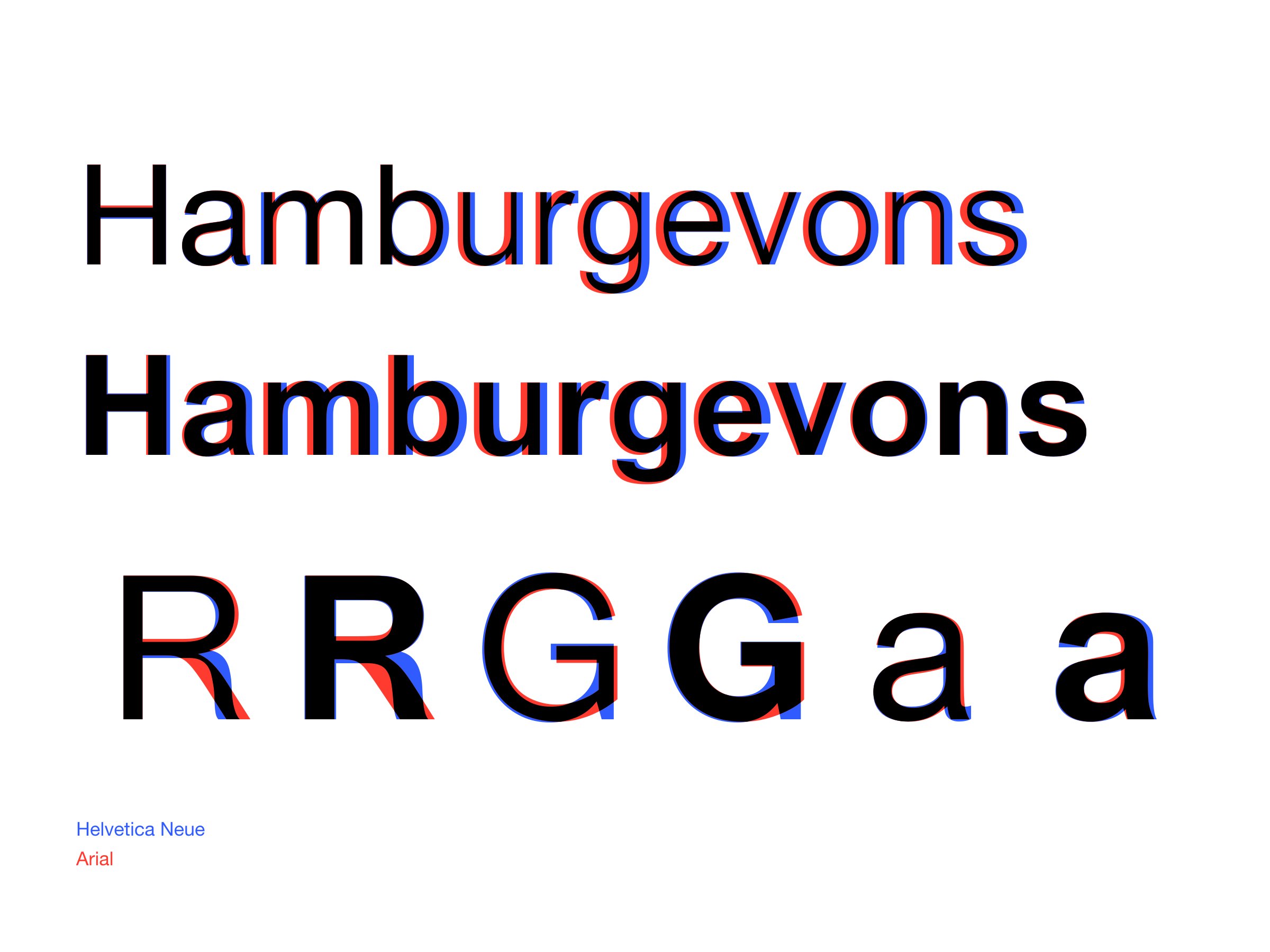
Helvetica was designed in 1957 at the Haas type foundry in Switzerland by Max Miedinger and the foundry’s director, Eduard Hoffmann. Its first name was Neue Haas Grotesk; in 1960 it was renamed Helvetica, after Helvetia, the Latin name for Switzerland. The aim was a neutral typeface with no meaning of its own in its forms, extremely clear and usable on any kind of sign.
Helvetica Neue (Neue Helvetica) was released in 1983 by D. Stempel AG, a subsidiary of Linotype. The 1957 design was reworked, and its weights and widths were brought together in a single system. Apple used Helvetica as the system font on the first iPhone, and Helvetica Neue from iOS 7 in 2013.
Helvetica is the approaches above, set in type: It shows not itself but the words it carries. Its clarity answers Tschichold, its neutrality Müller-Brockmann, and its timelessness Vignelli. The posts on this site are set in Helvetica Neue too.
What they share
The four examples were designed in different decades, for different purposes. But all four show the same thing: What’s unnecessary has been removed, every remaining element has a reason, and that reason serves the user. The seven approaches and the ten principles that define good design are, in the end, different faces of that one sentence.
Sources
- Ten principles for good design – Vitsœ
- Jony Ive design quotes – devdaily
- Jony Ive, Designed by Apple in California – Dazed
- Grid Systems: Müller-Brockmann – Designlab
- Massimo Vignelli – GDUSA
- Jan Tschichold, The New Typography (1928)
- A History of Braun Design: Audio Products – Core77
- Supporto chair – Mr Bigglesworthy
- Supporto – Design Week (1995)
- Helvetica – Wikipedia archive
- Helvetica vs. Neue Helvetica – CreativePro
- Apple’s font choices – Creative Bloq