Typography: the design of letters
What sets one typeface apart from another? The basics of typography through the word Hamburgevons, the skeletons of letters, and fonts placed side by side.
The same sentence set in two different fonts doesn’t say the same thing. The shape of the letters decides how a text is read, how much trust it inspires, and where it reads comfortably.
What is typography?
Typography is the work of arranging the visible form of writing: which typeface to choose, at what size and spacing the letters are set, and where on the page they go. A typeface itself (Helvetica, for example) is a family; a font is a specific member of that family (Helvetica Bold, for example). In everyday language, the two are used interchangeably.
Good typography goes unnoticed. The reader reads the text and doesn’t see the letters. Bad typography is noticed at once: cramped lines, tiny letters that can’t be read, fonts that don’t sit well together. That’s why typography is the most invisible, and the most used, part of good design.
Hamburgevons
Type designers often test a font with the same word: Hamburgevons. The word has no meaning; its letters are chosen to show a font’s most characteristic shapes at a glance:
- H: straight vertical strokes and cap height
- a, e, g: the lowercase letters that give away a font’s character the most
- m, n, u: rhythm and letter spacing
- b and g: ascenders and descenders
- v: diagonal strokes
- o, s: round forms and curves
The fastest way to get to know a font is to set Hamburgevons in it. All the comparisons below were made with this word.
The skeleton of a letter
Every letter we see on screen is actually a drawing. A font file describes the outline of each letter with points and curves; the screen or printer fills that outline at the size requested. That’s why a letter never loses its sharpness, however much it’s enlarged.
The figure below shows the skeleton of the letters “Hdag” in Helvetica Neue:
- The blue horizontal lines are the font’s system of measurements. The baseline is the line the letters sit on. The x-height is the height of lowercase letters (like x, a, o). Cap height is where H reaches, the ascender where d reaches, and the descender where g reaches.
- The dashed vertical lines mark the space each letter occupies. The letter sits inside this space, with room left on either side; letter spacing comes from these gaps.
- The filled squares are points on the outline. The hollow circles are control points that steer the curve; the curve never touches them, it only bends towards them.
There’s an interesting detail in the figure: In Helvetica, the ascender of d is almost exactly the height of H. In many fonts, ascenders are a little taller than capitals; Helvetica’s tidy, tight look comes partly from this.
Kinds of typeface
At first glance, typefaces fall into two groups: those with small projections at the ends of their strokes (serifs) and those without (sans-serif). Each group has distinct families of its own:
- Old-style serif: Carries traces of pen writing. The contrast between thick and thin strokes is soft, and the curves sit on a slightly tilted axis. Example: Hoefler Text.
- Modern serif: Very high contrast between thick and thin strokes; hairline-thin serifs. It looks striking and elegant. Example: Bodoni 72.
- Slab serif: Thick, square serifs and almost no contrast between strokes. It looks strong and sturdy. Example: Rockwell.
- Geometric sans-serif: Letters are built from basic shapes like circles, triangles and squares; the o is an almost perfect circle. Example: Futura.
- Humanist sans-serif: No serifs, but it keeps the proportions of handwriting; warmer and more readable. Example: Gill Sans.
- Neo-grotesque sans-serif: Neutral, orderly and tight; the ends of the strokes are cut horizontally. Example: Helvetica Neue.
In the figure below, all six fonts set Hamburgevons at the same size. The same letters take on six different characters.
Close relatives
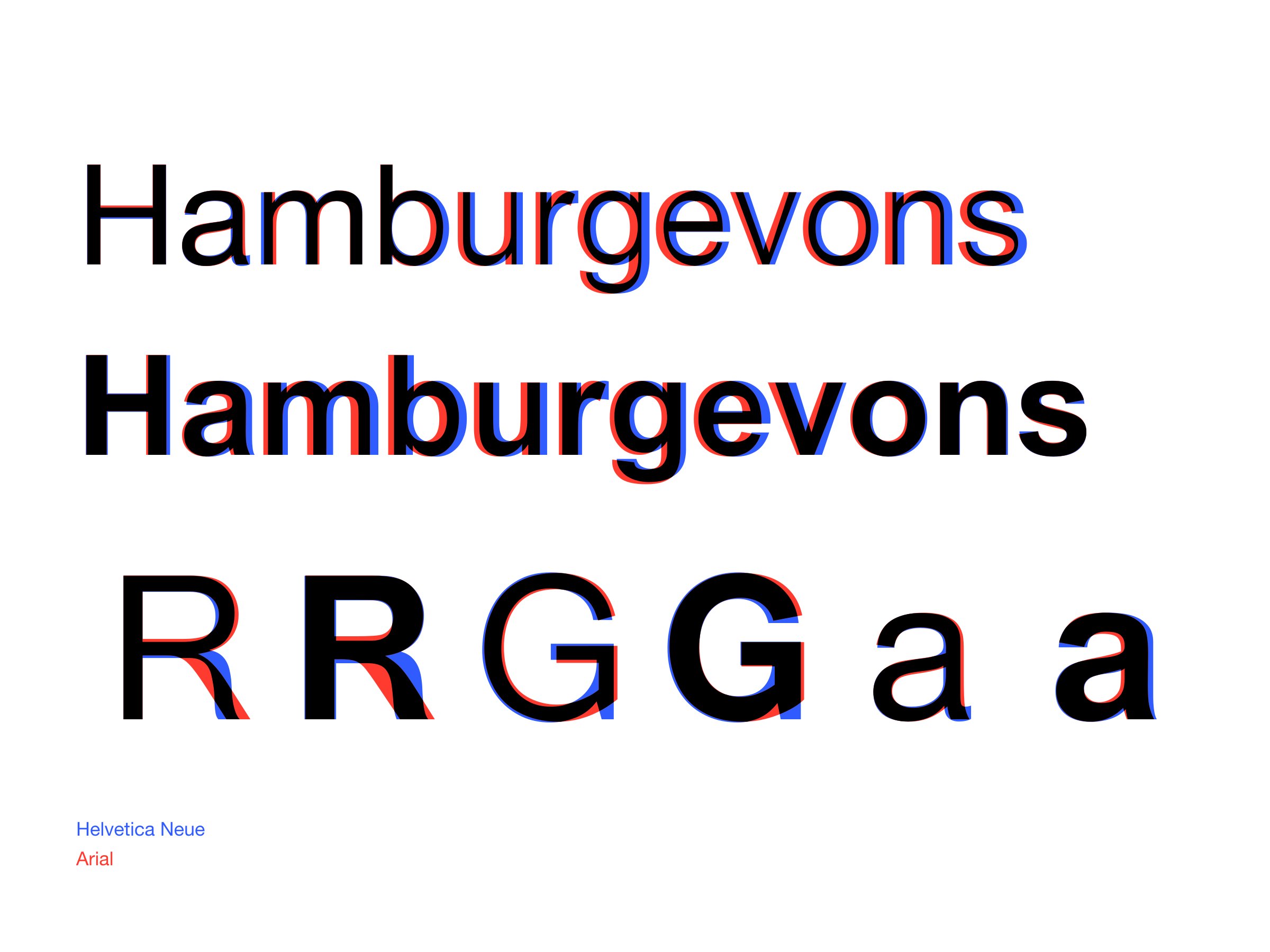
Some fonts look identical at first glance. The pair most often confused is Helvetica and Arial. Arial was designed in 1982 by Robin Nicholas and Patricia Saunders for Monotype. Its aim was to be metrically compatible with Helvetica: Each letter takes up the same width as its Helvetica counterpart. This meant a document set in Helvetica could be printed in Arial without the line breaks changing.
The widths are the same, but the shapes are not. Arial is rounder than Helvetica; its curves are softer and fuller, and the spaces inside its letters are more open. Four letters show the differences best:
- R: In Helvetica, the leg drops vertically and curves; in Arial, it drops on a diagonal.
- G: Helvetica’s G has a small spur at the bottom; Arial’s doesn’t.
- t: In Helvetica, the top is cut flat; in Arial, it’s cut at an angle.
- a: In Helvetica, the tail curls; in Arial, it ends straight.
SF Pro, which Apple introduced in 2015 to replace Helvetica Neue as its system font, also sits close to this family. Put the three side by side, and you see that even fonts of the same kind have characters of their own.
The cover shows the same comparison: Helvetica Neue in blue, Arial in red, the overlapping areas in black. The red drifts further right as the word goes on because Arial’s letter widths were matched not to Helvetica Neue but to the original Helvetica of 1957.
Screen and print
A font is designed for the medium it will be read in. On the low-resolution screens of the 1990s, fonts designed for print fell apart at small sizes: thin strokes disappeared and letters ran into each other. To solve this, Microsoft asked type designer Matthew Carter for two fonts: the serif Georgia and the sans-serif Verdana. Both were released in 1996.
Carter’s solution comes down to three points:
- A large x-height: Lowercase letters are taller, so they stay readable at small sizes.
- Heavier thin strokes: Georgia’s thin strokes are thicker than those of a font designed for print; they don’t vanish on screen.
- Generous spacing: In Verdana, letters are wider and further apart; even in bold, they don’t touch.
In the figure below, the four fonts are at the same size. The blue lines show the baseline and the x-height. Georgia’s lowercase letters are clearly taller than Times New Roman’s, and Verdana’s taller than Helvetica’s.
On today’s high-resolution screens, this difference isn’t as decisive as it used to be. But the principle still holds: When choosing a font, you need to know at what size and where the text will be read.
Choosing the right font
The right font depends on what the text is for. Asking four questions before choosing is usually enough:
- Where will it be read? On screen, on paper, on a sign? At small sizes and on screens, fonts with a large x-height read more comfortably.
- How long is it? For long texts, fonts that don’t tire the eye and look ordinary; for headings, fonts with more character.
- What does it need to say? A slab serif feels sturdy, a modern serif elegant, a neo-grotesque neutral. The font shouldn’t contradict what the text says.
- How many fonts are needed? Usually one or two. Different weights of the same family give a more orderly result than different fonts.
Why Helvetica Neue?
This site’s answer is a single font: Helvetica Neue, in regular and bold only. The choice is less a matter of taste than a direct consequence of the principles that define good design (see What is good design?):
- Less, but better (Dieter Rams): One font, two weights. The difference between heading and text is made by size and weight, not by a new font. Every unnecessary option stays out.
- Invisibility (Jony Ive): Helvetica Neue doesn’t show itself. The reader sees the words, not the font. It’s no surprise that Apple used it in its interfaces for years.
- Objectivity and order (Josef Müller-Brockmann): Helvetica was born from the Swiss Style tradition that Müller-Brockmann was part of. On a page built on a grid, a neutral typeface brings the order itself forward. This site’s 12-column grid rests on the same idea.
- Timelessness (Massimo Vignelli): It has been in use since 1957 and still doesn’t look dated. As Vignelli said, good design is a language, not a style.
- Clarity (Jan Tschichold): Unadorned letters, orderly proportions and horizontally cut stroke ends. What the text says comes before how the letters look.
In Rams’s words: as little design as possible. It’s hard to think of a better yardstick for a site’s typeface.
Sources
- Arial – Wikipedia
- Arial vs. Helvetica – Fonts.com
- Georgia (typeface) – Wikipedia
- Verdana – Wikipedia
- Verdana – CUNY OpenLab
- Helvetica – Wikipedia archive
The figures were drawn by converting the letter outlines in font files installed on a Mac directly into vectors.